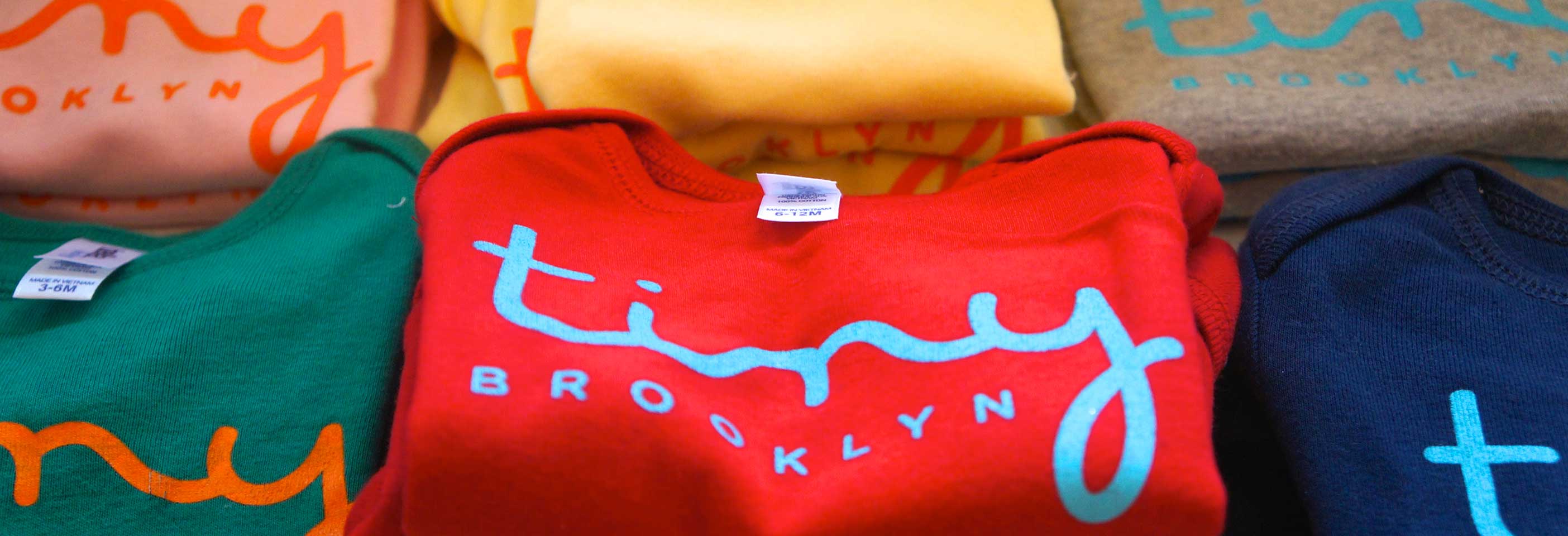
tiny brooklyn
When it came time to give birth to a new retail brand that was the spawn of two young women (one mother and one to be), the word “organic” was thrown around quite a bit. Both in the products they were to carry but also in regards to the essence of the identity. So, after brainstorming the store name, we set about creating an iconic logo that would not only say “organic” but also “chic unique boutique.”
To meet a looming store opening the team needed to work fast to develop the identity, palette and associated graphics and apply them to cards, bags, onesies and of course, the storefront. Designing and painting a brick and mortar was a first for Revved Design but we relished the challenge and are thoroughly satisfied by the result, as were our clients.

 4 mood boards provide a range of stylistic directions.
 Each design concept was visualized as it might appear to in real life.

A concept chosen and evolved with further proofs of concept.
 A polka dot stencil is custom-made. A sign is hand painted.

The store opening!

Two young window gazers.

Store-branded merchandise on display.

An early customer.


